|
|
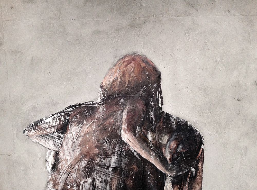
1: A possible defense of trash digging.
|
|
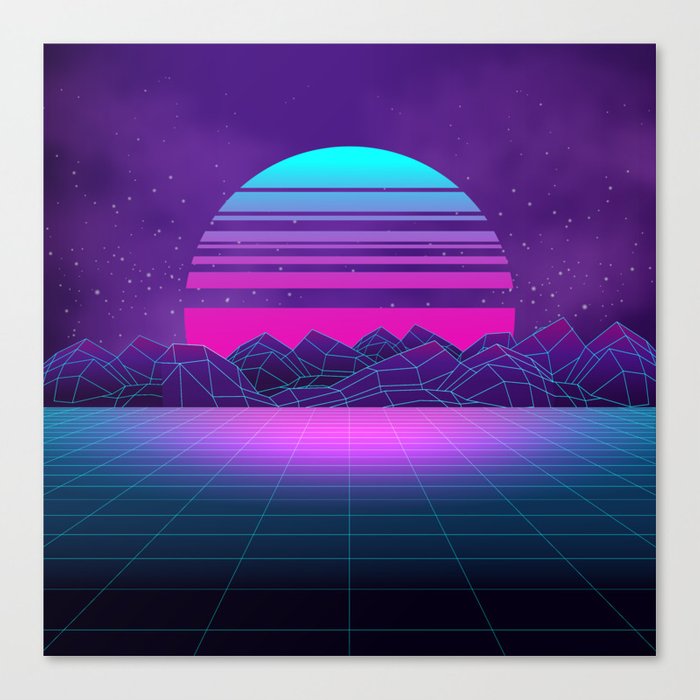
In the ever-moving landscape of electronic music, there is a genre called Vaporwave. It is already considered dead by some of it’s strongest proponents, but the internet has cataloged and organized the dozens of self proclaimed sub-genres and projects that it spawned.
|
|
|
|
Vaporwave is a deconstruction, meditation, lampooning- and thereby an homage- to the popular culture of the 80’s in America. It pulls electronic sounds into loops, and clones the pastel-streaked atmosphere of the music- clipped beats under chunks of sexy saxophone with cavernous reverb, creating an atmosphere that evokes glowing neon and grainy VCR footage of birthday parties and malls. Of people moonwalking along the gridded walls of Radio Shacks, Miller’s Outpost, Orange Julius, Contempo Casuals, B Dalton’s, and Z Galleries that exist in our memories.
|
|
At least, these things exist in our memories so long as we’re of a certain age. And Vaporwave creators are not that age. They glorify a time that seems in our retrospect to have been almost completely devoid of culture. A decade that has been refused as tacky, childish, consumer-driven, and useless. These Vaporwave kids make art from our cultural trash, and it’s informed by the music as well as by the era's other media.
|
|
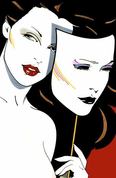
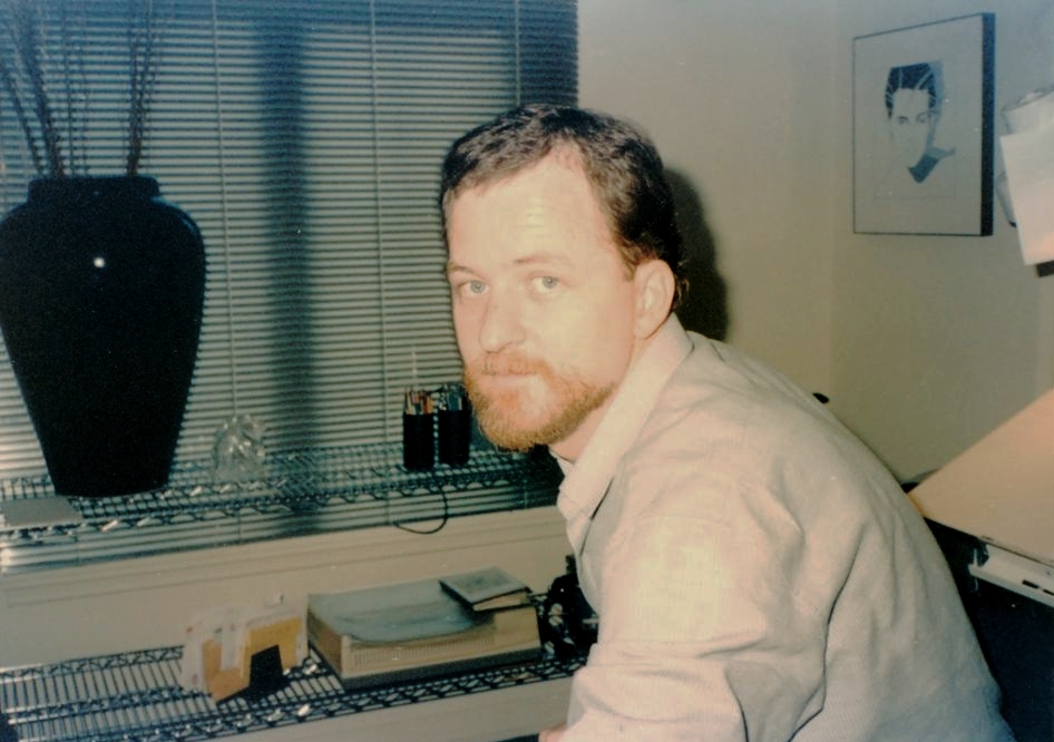
And from that decade there is an artist who stands apart from the rest. One artist who now typifies the decade with his unique visual style. And who now seems mostly ignored by a culture who once clamored for his work.
|
|
|
2: Nothing is ever as neat as you think.
|
We like to funnel things into even decades. The 60’s, 70’s, 80’s, etc. But if you were to pick up a weekly magazine or watch a program that was created at any point in these eras, you’ll see that culture does not evenly distribute on the 10’s. So when we think of “The 80’s” we’re talking about influences that started before the decade, and influences that stuck around into the 90’s.
|
And the biggest selling visual artist of this era wasn’t necessarily born of his time either. He was like all of us: an amalgam of his history, set loose on his future.
|
He was a paratrooper in the Vietnam war. He loved Martinis and he smoked like a chimney. He ate frozen snickers bars and relied on pots of coffee and fast food. He was inspired by early print illustrators like JC Leyendecker and Norman Rockwell, as well as 40’s pinup artists like Alberto Vargas. He loved Japanese block prints, film noir, and the Art Deco movement- which was poised for a revival at this time.
|
His visual style would become synonymous with the word “fashion” and would cross all social strata. His work could be found uptown in fine art galleries, and knockoffs done in his style would fill the windows of downtown hair and nail salons. At his height an estimated 2 million American homes had one of his prints, and they decorated the walls of chain hotels and restaurants. His work penetrated American culture in a way that most art never gets an opportunity to- and it fell out of fashion and was put on the doorstep of the local Salvation Army just as abruptly.
|
But in 1984, as his fame was cresting, he was asked to participate in that most 80’s of charity events- the Celebrity Aerobathon.
|
He spent 15 minutes on TV working out for charity, then returned sweating to his car where he died alone of a heart attack in the front seat.
|
|
|
|
3. You humanized him, now talk about his chops.
|
|
|
Patrick Nagel had a heart defect that went undetected during his life. And between the fast food and martinis, he was not much of an exerciser.
|
But some of the women in his paintings gave the impression that they were coming from the gym, with their spandex bodysuits beneath oversized sweatshirts sloped off the shoulder, and headbands providing structure to the piles of clean, impeccably tossed hair. They were not a personal fantasy- He had been wary of the women in his paintings; he felt they were thin and terribly pale. He mused to friends that he didn’t really want to get to know them- they were like vampires. He said that the women he painted stayed up too late and smoked too much. Perhaps they recognized each other.
|
|
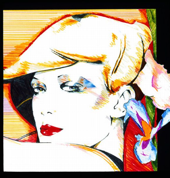
When we think of Nagel’s work, we’re thinking of the thousands of prints that were made from a handful of original paintings done towards the end of his life. But his work in the decade before was primarily commercial art- including hundreds of illustrations for advertising, print and book covers. Every issue of Playboy since 1974 had at least one Nagel illustration between it’s covers- often it was three or more (Hefner and the Playboy estate currently hold the largest collection of Nagel’s work.)
|
|
|
|
Born in Ohio, his family moved to California when he was young, so he always considered himself an L.A. native. After returning from his tour in Vietnam he enrolled in the Chouinard institute, a school that Walt Disney sent his animators to- and that later merged with another institution to become CalArts. Graduating from Chouinard in 1969, he then went on to earn a BFA from Cal State Fullerton and began freelancing in illustration. He padded his income with teaching at the other great LA creative school, Art Center in Pasadena.
|
|
|
|
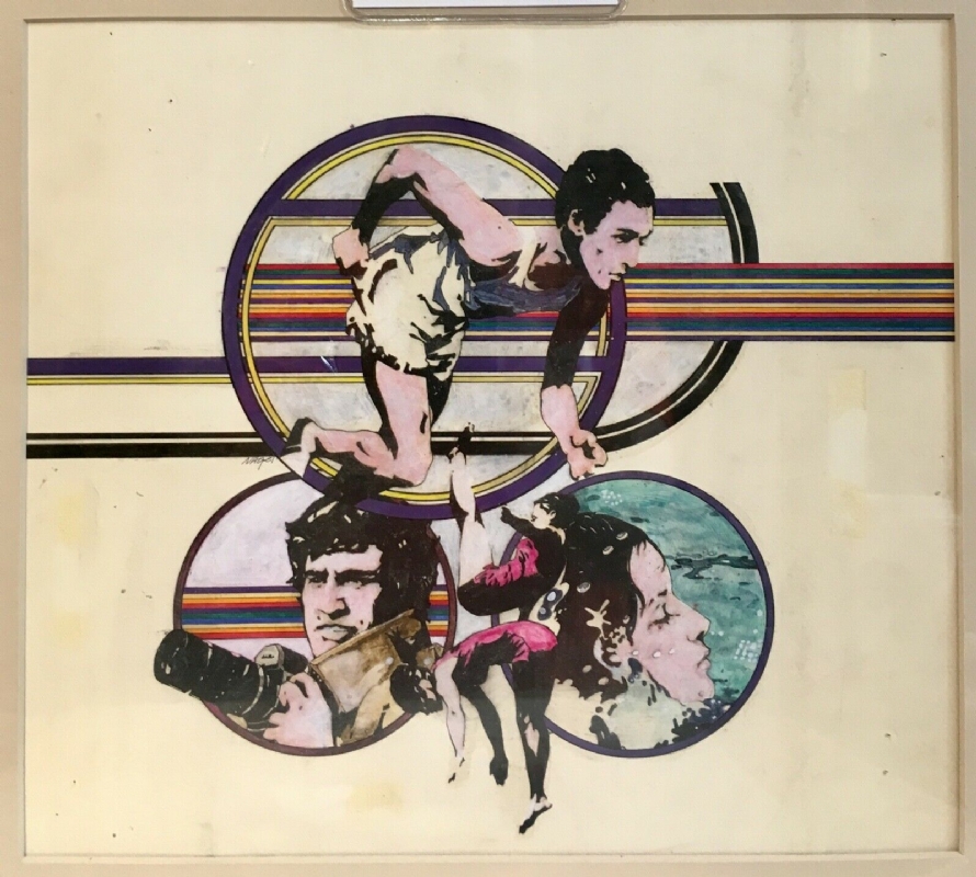
He also brought his developing style into other mediums. In 1981 he designed the set and costumes for David Copperfield’s audacious TV special where the magician made a LearJet disappear. Not only did Nagel set-design the performance, create art for the stage and title cuts, but the plane’s tail was emblazoned with Nagel’s portrait of Copperfield.
|
|

|
|
After years of working in this field he had developed a unique style that seemed to stand out, and had begun focusing on illustrating women and fashion. In light of all this, it makes sense that it’s through a commercial product that most of us were exposed to Nagel first:
|
|
|
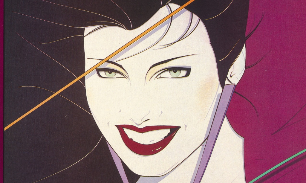
Nagel had been a working illustrator for almost a decade when Duran’s Duran’s Rio came out in May of 1982. One of his illustrations was picked by the designer Malcolm Garret and placed within Garret’s own design and typeset. Garret designed many albums of the 80’s, but Nagel’s work was such a fresh presence that we barely remember the surrounding details. Garret knew enough to let the striking work almost stand alone, and it generated a relationship of art to music with a strength that few bands get the opportunity to enjoy.
|
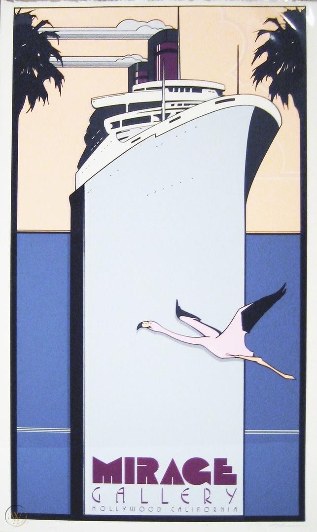
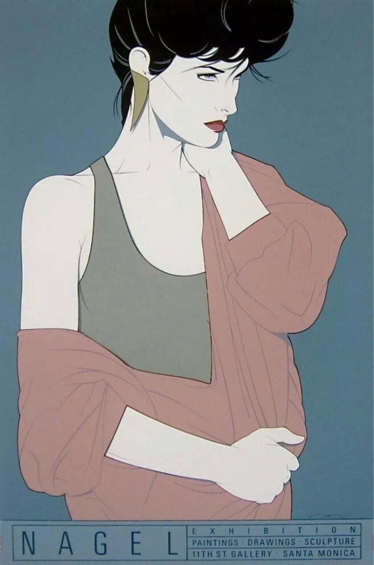
In addition to graphic work like this, Nagel had also been shopping his paintings in other markets- dropping his portfolio at galleries in LA. One of them was the Mirage Gallery, owned by Karl Bornstein who was looking for new talent for printmaking endeavors. Bornstein recognized immediately how well Nagel’s work would translate to printmaking and soon, under an exclusive deal with Mirage, his paintings of women were being made into limited edition serigraphs and sold at galleries alongside the originals. Nagel’s illustration work always remained his own, but the gallery paintings were all under contract with Mirage.
|
|
After some time, the fine art world started tuning in to this work. He took celebrity commissions; Joan Collins went on the Tonight Show in 1982 and talked about Nagel’s portrait of her. In addition to the high profile work and his illustrations for Playboy, he was also kicking out fresh paintings each month. All of them variations on the theme in his signature style.
|
|
|
Part 4: An illustrator masquerading as an artist.
|
|
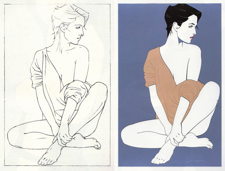
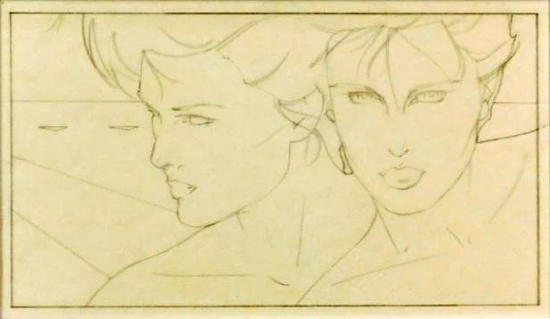
There is not much material to find regarding his working methods and process, but it also doesn't seem to have ever veered much. Most of the original paintings were meant for galleries, so Nagel painted them on large canvas in order to capitalize on a fine art price tag. But illustration is practical work- all deadlines and drying times- and illustrators rarely painted so large and used canvas even less, preferring boards and smoother surfaces. You can see in Nagel’s fine art that there were concessions to the illustrative nature of his process; he often backed his canvases with plywood to create a stiffer surface, and he painted with thinned acrylics to better showcase his style. The flat colors and clean lines were perfect for the serigraph market, feeling more at home on paper- more like a block print than a painting.
|
|
|
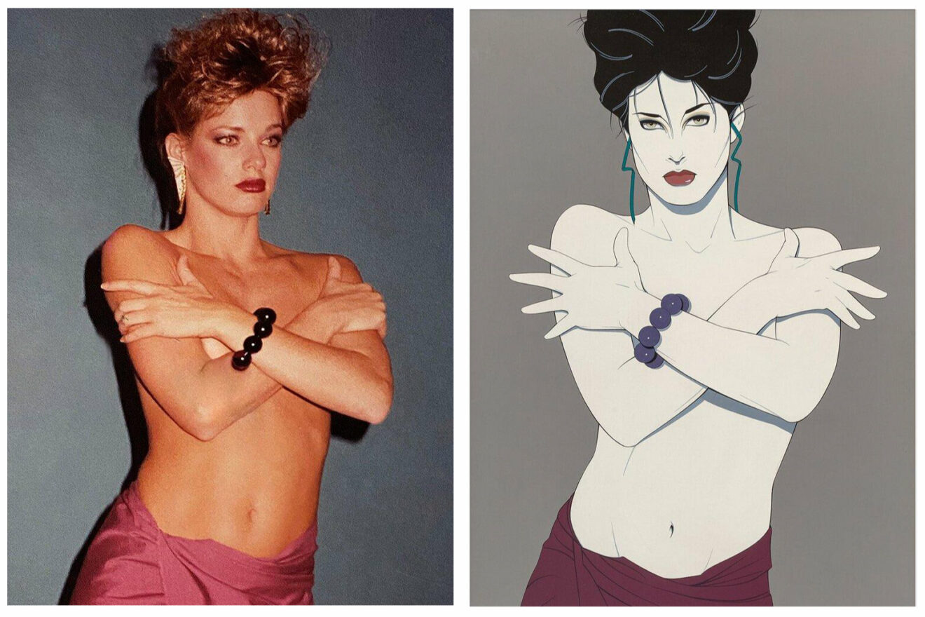
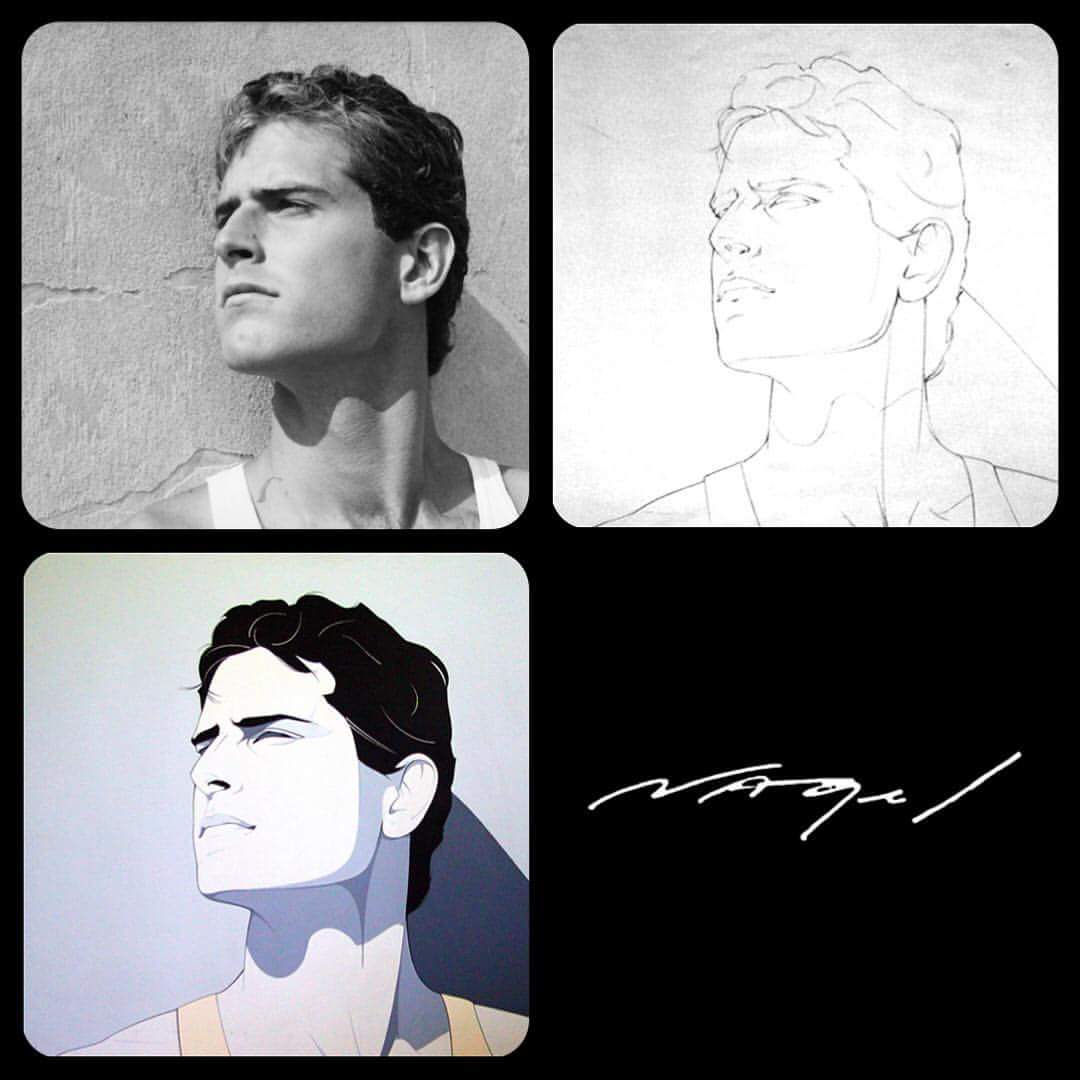
As far as the workflow, he seems to have used the same process for creating almost all of his work: rough thumbnails to get the idea started and a photo reference session with models, followed by a large drawing focused on simplifying forms and arriving at the final composition. Then transfer that drawing to canvas and fill it in with paint.
|
|
This sensible approach to art-making is not one that we would normally associate with the idea of the temperamental 20th century artist. Jean Michel Basquiat- one of the most influential fine artists of this time- had his first west coast show the same month that Rio hit the record shops. Other icons such as Jenny Holzer, Eric Fischl, and Keith Haring were filling the fine art spotlight- all work that was highly conceptual and boldly produced. They were working large and it was thick, painterly, confrontational and uncontrolled. All at odds with Nagel’s clean, flat, desaturated and static work.
|
|
|
Because of this, It is inconvenient to put Nagel in the same space as his contemporaries. He is working at a historically low point in the business of commercial illustration and his style, when translated to fine art, is too graphic, too subtle and clean for contemporary art’s explosion of direct expression, and cultural reckoning of the 80’s.
|
In some ways, Nagel’s work aims too low. While it is considered sexy- sometimes even pornographic- Nagel’s work wasn’t ever considered rebellious. Watch the only surviving video interview of Nagel and you will see that he was as easy going as his work. He is practical and humble about his paintings and their place.
|
He seems to have lived up to what his assistant said was Nagel’s only observation about dealing with being shot at in Vietnam:
|
|
“You learn to not take it personally.”
|
|
|
|
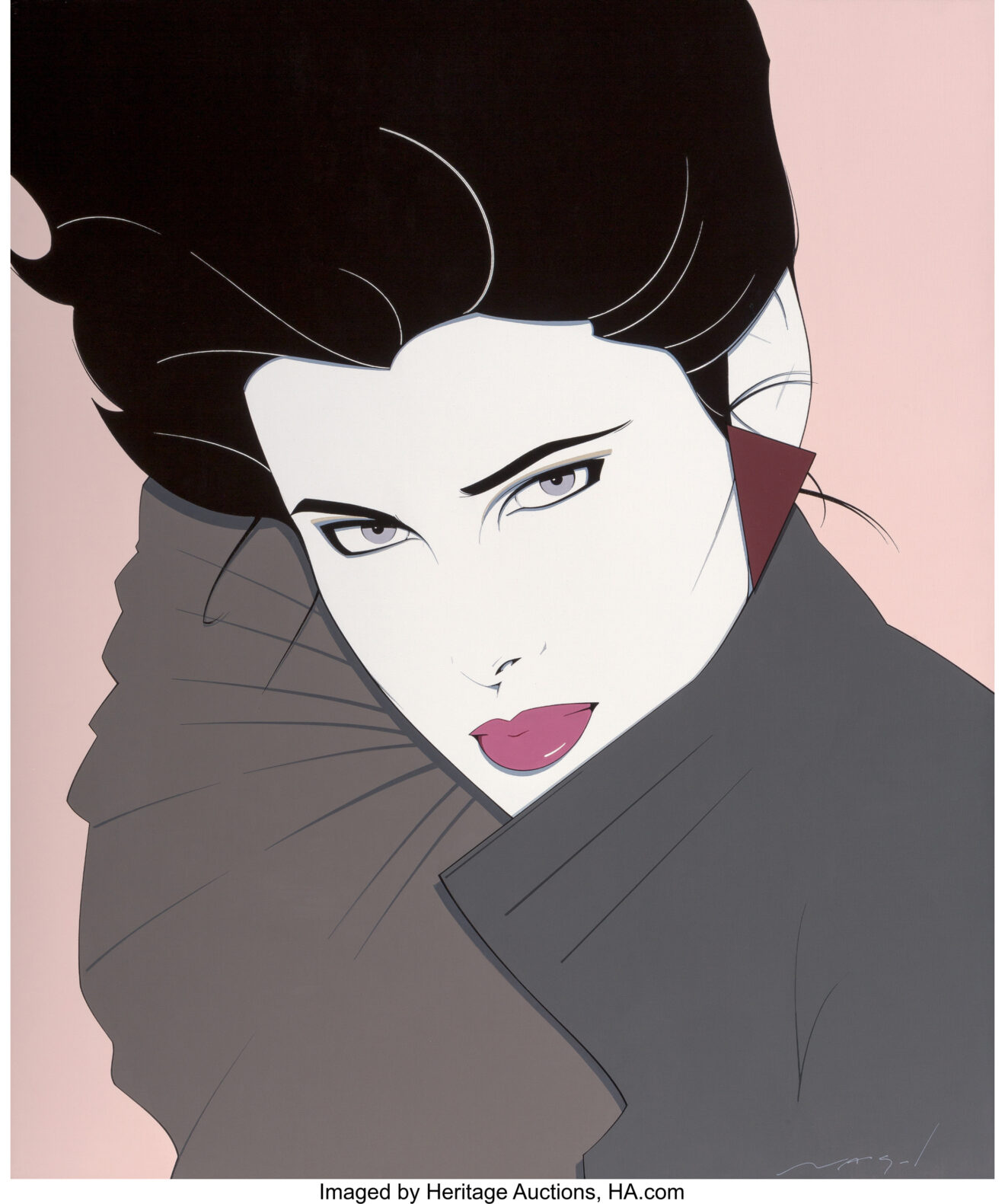
His work also had a strong cohesiveness of color. His studio assistant said that he loved Paynes Grey, a pigment named for the 18th century watercolorist who developed it. When undiluted, it is an excellent substitute for black, and when mixed with other colors it can serve to bring more disparate tones into harmony, likely leading Nagel to the softer pastels and muted colors that became a signature of his work.
|
|
|
So for all these reasons, It’s clear that Nagel was first and foremost an illustrator, being funneled by money and success into a more accessible segment of the fine art world. Some critics think that Nagel's work was used to create a new market entirely, a market that aimed for the masses, that grew through middle class fancy into a cheesecake suburb of the artistic landscape- built for single men on cocaine to decorate their apartments. But I think there is a great deal of refinement to find in his work.
|
|
To our modern sensibilities the style that he developed- with its confident forms reduced to essence in flat colors and clean lines, lively graphic shapes and ribbons floating around the picture plane, rendered with sharp subtle drop shadows- all feel digital. But Patrick Nagel passed away the same year that the first desktop computer hit the market. Everything Nagel created was done by hand- a hand that had developed a precision that might feel more at home in an entirely different pool of commercial illustration- working up diagrams for engineering journals or architectural renderings. He understood the great virtue of reducing space and volume to its essence. Building a clarity of information with a confidence that owes itself to the Japanese block prints he admired, and the unapologetic forms of the Art Deco that inspired him.
|
|
Part 5: What we might decide to take away.
|
|
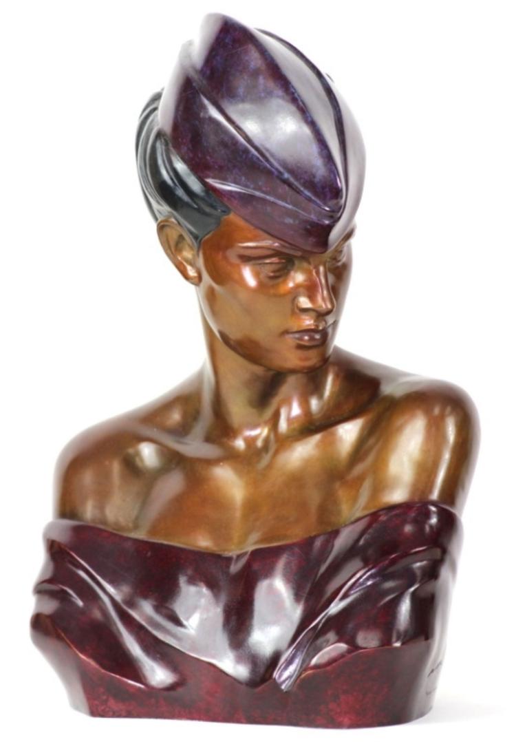
When Nagel passed, Mirage Gallery put out a press release avowing the enduring legacy and future impact of the artist. They also soon began printing commemorative prints in volume, all of which included a Nagel signature in the printed screen. These “Signed in Screen” or “SIS” prints are the majority of the work that survives. Mirage also put out two sculptures that had been in process before Nagel passed. The sculptures were intended to compete with the popularity of the art deco revivalist pieces by artists such as Erté, and there is no indication that these would have passed the final quality control that Nagel employed with his prints. But they were minted after his passing and like most of his work, there are precious few of them that survive.
|
|
|
So much of what happened after his death is a tale we might be familiar with- it includes the typical money men and gallery greed, a market flooded with cheap commemorative prints, an FBI bust of a forgery ring, law suits, and probably a few boatloads of cocaine. It is fascinating, and it has all been documented in other places. While his life was far too short, his impact on that time is without measure. It continues to influence our perceptions of an era- it has become cultural shorthand, a visual hyperlink that will take you directly to an American memory.
|
|
It’s worth noting that despite a fairly rabid private market for his work, I can find no major museum that has a Patrick Nagel original. MOMA offers up a copy of the Rio album cover in their online collection, but it is catalogued as a collaboration with Malcolm Garret. Garret has three such works listed with them, but this is Nagel’s only reference. At his height, his paintings were part of prominent museum shows, but if there is an original Nagel still in a museum collection somewhere they must keep it the way most Americans do; in the back of a closet, perhaps in a tarnishing chrome frame.
|
|
|
If we look at the majority of his subjects in his unique visual style, and assess the work from here- perhaps through the lens of late-century capitalist greed, or pass judgement on the content as a third-wave-feminist reclaiming of the pinup tradition, we’ll never know exactly what his intention was because Patrick Nagel was gone before the decade was even half done.
|
I've done a fair amount of research, and I’m not convinced that he ever thought about his legacy as much as I might have when writing this essay. If he did think larger than the gig required, he was very quiet about it and perhaps content to let others control the narrative. We don’t know whether he would have appreciated becoming the household name that he did, for the brief time that he was.
|
But his legacy does deserve more than to be donated the the Goodwill. Lumped in with rolled-up suit sleeves and parachute pants- the sea foam of some regrettable cultural wave.
|
|
He is an artist who upon closer inspection, pans out to be more than a great painter. He is one hell of an illustrator.
|
|
|
|
|
This essay has been kicking around for a LONG time. For some reason it has been one of the hardest things for me to get down. I've written double the amount of words that I included here, in the attempt to pick apart Patrick Nagel. I find him and his work to be opaque- Was he a trashy pin up artist, or more? Should he be important? What do I get from him?
|
Ultimately I realized I had to stop writing so much and treat this the way that Nagel worked- by refining and reducing until a truth, or a beauty, emerged. And I have my partner Sarah to thank for listening to version after version of this and helping me to clarify my intent. Her key quote to me was "What you want to do is humanize him, then talk about his chops." Hopefully that came across in this sketch. And hopefully there are no typos, after all this time working.
|
I have plenty more to say about Nagel so feel free to let me know what you think. Thank you for reading.
|
|
(All images used in this essay are for review purposes only, and copyright their respective owners or public domain.)
|
|
|
|
Highlights from the archives
|
|
There have been over 50 of these email missives, so you might enjoy this look back to a piece from (gulp!) 2015:
|
|
|
|
|
|
|
Enough about Nagel's process, how about some of my own? Here is the first of a two-part meditation on my work to finish a painting of a myth.
|
|
It also includes notes on classic rock's contribution to the understanding of our creative dance with the universe of ideas.
|
|
|
|
|
|
|
|
Please feel free to share this issue, or something from the archives. Like the jurassic internet, this thing subsists on word of mouth from longtailed comets like yourselves.
|
This Sorry Spacesuit was started (and continues to be hungry like the wolf) as a place to support conversations that don't fit into algorithms or truncated tweets, I don't care about your data or your browsing habits, but I am always interested in hearing your perspective. Feel free to reply.
|
|

|
|
|
|
|
|
|
|